House of Skinsensials

Brand identity & website for a financial admin partner built for freelancers.

Client

Mizen

Services

Brand strategy · Visual identity · Web design & development

Year

2024

Industry

Financial services for ZZP'ers

"Bij Mizen helpen wij jouw onderneming groeien en bloeien."

At Mizen, we help your business grow and thrive.

01.

The challenge

BRAND VOICE

Aimed at young freelancers with a one-person business — a tone that balances 50% playfulness with 50% professionalism.

Many entrepreneurs feel uncertain about their financial administration and carry a quiet fear of the tax authority. Mizen exists to give business owners confidence in their own companies and take that burden off their hands — turning the unfamiliar and confusing parts of finance into clarity and support, so entrepreneurs can keep growing.

"You're moving from a heavy storm into calm waters."

02.

The concept

Mizen means 'scale' in Arabic — the idea of balance runs through everything, from the name to the mark.

03.

Visual identity

Wordmark

The custom rounded typeface carries two arc marks — a smile above the "i" and an inverted arc below the word — together forming a balance scale symbol.

Teal · Lavender · Off-white · Navy — four primary colorway combinations.

Logo mark

The hourglass-and-ring mark abstracts the balance concept into a standalone symbol — the two opposing arcs through a double circle read as scales at a glance.

The balance motif — two mirrored arcs in a double ring — is the brand's most versatile standalone asset.

Color Pallete

PRIMARY

Balans

#03444E

Plezier

D2C7F7

Zen

#F4F3ED

Integriteit

#191930

Secondary

Balans

#03444E

Plezier

D2C7F7

Zen

#F4F3ED

Integriteit

#191930

The primary colors carry a youthful, fresh energy while staying professional; the secondary palette balances liveliness with calm.

04.

Brought to life

Social templates

Mizen

Veenendaal

Zorgeloos ondernemen

Bekijk wat bij jou past

Mizen

Veenendaal

Zorgeloos ondernemen

Bekijk wat bij jou past

Mizen

Veenendaal

Zorgeloos ondernemen

Bekijk wat bij jou past

De halve cirkels, symbolisch voor balans, worden in de posts gebruikt. Op sociale media wordt uitsluitend Source Serif 4 gebruikt voor de H1 — voor een extra dimensie van speelsheid.

Stationery & print

Environmental & signage

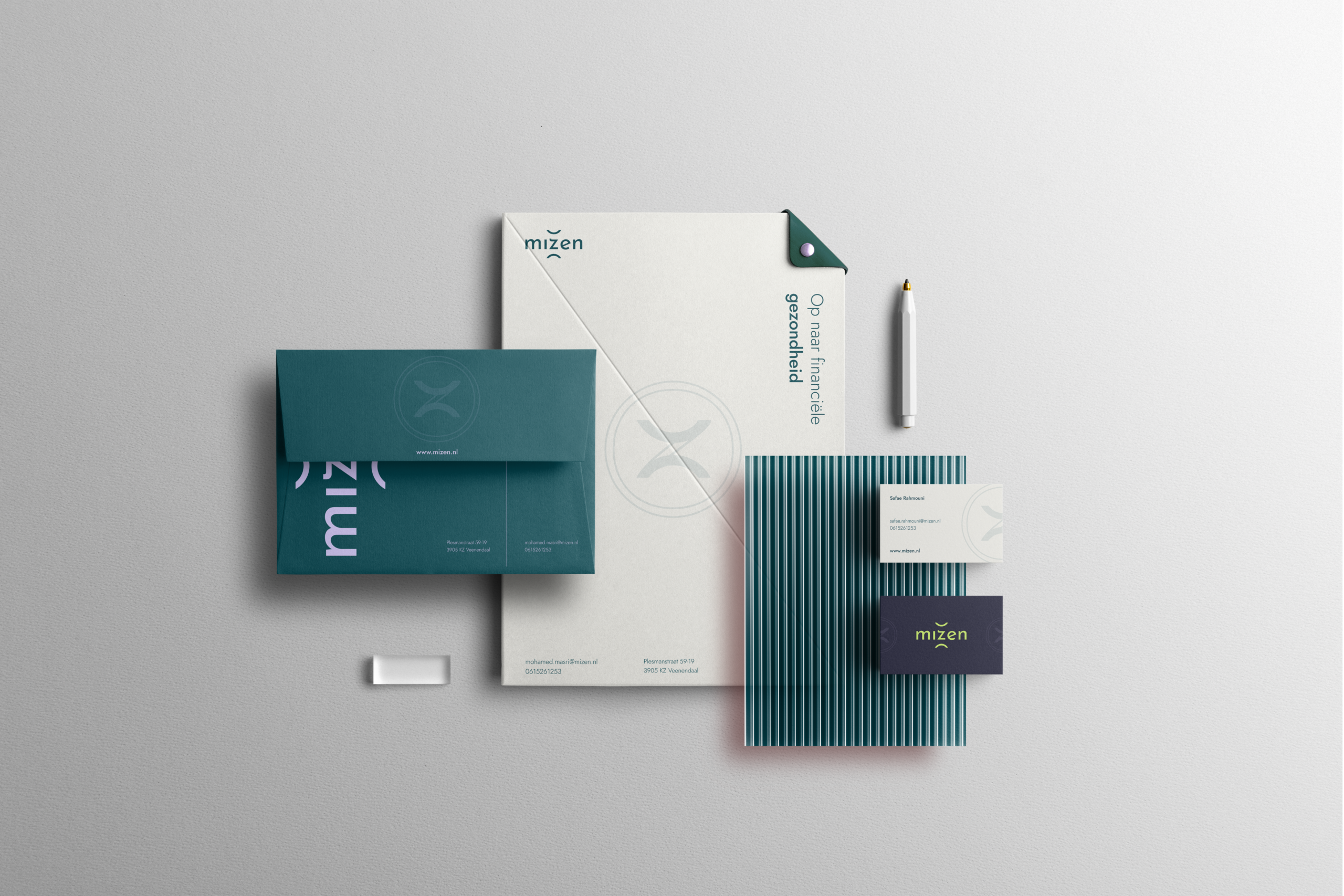
The balance motif — two mirrored arcs — recurs across social templates, print, and signage, reinforcing recognition everywhere the brand shows up.
05.

The website

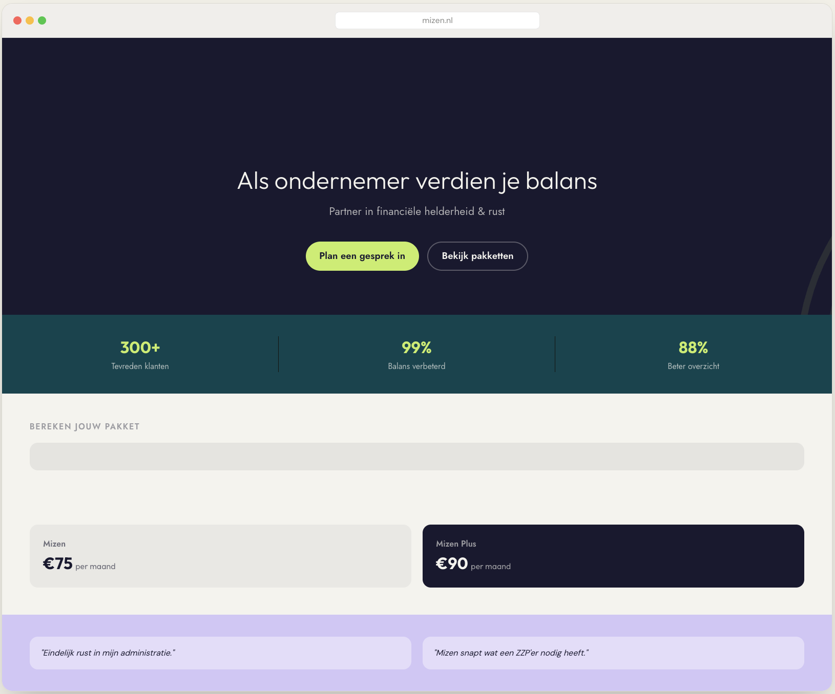
The identity carries through into a full website built to convert — from first visit to booked intake.

De halve cirkels, symbolisch voor balans, worden in de posts gebruikt. Op sociale media wordt uitsluitend Source Serif 4 gebruikt voor de H1 — voor een extra dimensie van speelsheid.